
Sweater
Design the sweatshirt you've always imagined in your minds eye, and bring it to life.
Weather
Project Overview
Sweater Weather is a custom sweatshirt website that offers users the ability to create customizable sweatshirts at low, affordable prices
My Role
UX designer designing Sweater Weather website from conception to delivery
Responsibilities
Conducting interviews, paper and digital wireframing, low and high-fidelity prototyping, conducting usability tests, and iterating on designs
Project Duration
March 2022 - April 2022
The Problem
Ordering custom sweatshirts can be expensive if you only want to order a few, and many websites only give you control over a select number of customizable options. It can also be costly to upload custom artwork to use for your designs.
The Goal
Create a website that gives users complete design control, at a low, cost efficient price.
User Research
I conducted interviews to understand the users I am designing for and their needs. A major group I identified through research was creative individuals looking to design and order sweatshirts for fewer than 5 people.
This group also expressed a desire to have more control over customization options.
Pain Points
1
Having to purchase in bulk: In order to receive the discount or lowest price, users often need to be purchasing custom shirts in large orders of 30 or more.
2
No custom artwork: Many times there is an extra charge to upload custom artwork for shirt designs or users can only upload one artwork per design.
3
Lack of customization: There are only a handful of aspects of the design that users have control over, meaning they may not get the exact custom look they envisioned.
Persona: Millie
Problem Statement:
Millie is an artist, who needs several customizable options when ordering custom sweatshirts because she wants to create personal original sweatshirts showcasing her art

User Journey
Mapping Millie’s user journey revealed many of the areas that would benefit the user when customizing sweatshirt


Sitemap
When beginning the designing phase, an intuitive user flow was very important to me, as some users struggle with web navigation. I let this knowledge lead me through the creation of my site map.
The information architecture flow I chose was designed to make navigation simple and straightforward.
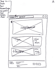
Paper Wireframes
Next, I went through several iterations of the homepage design on paper before I finally landed on the final layout. The design grants a clean and easily understood user flow. Allowing users to see only what they need on the home screen and then continue further in for more detail.


Paper Wireframes Screen Size Variation
To ensure that no matter what device users access the site on they still get the full experience, I created this design in both desktop view as well as a mobile layout. The mobile layout presents a slightly condensed version of the details while still having the most pertinent information front and center.


Digital Wireframes
Creating the digital wireframes based on the paper wireframes allowed for better visualization of how users would view the website in real time, and what parts of the screen should be highlighted most.

Multiple ways to access design studio to create custom designs

Many different features to customize, so user can have more control over shirt design
Digital Wireframes Screen Size Variations
Tablet Screen

Mobile Screen


Low-Fidelity Prototype
To create the prototype, I connected all the wireframes created that related to the main user flow of designing and ordering a custom sweatshirt.
Usability Study: Parameters
Study Type: Moderated usability study
Participants: 5 participants
Location: United States, remote
Length: 15-20 minutes
Usability Study: Findings
I conducted a single round of usability testing. Results of the study helped to guide the design from the wireframe to the mockup stage.
1
Button Location:
Users had difficulty finding navigation buttons when they appeared below the fold
2
Button Size:
The “Upload Image” button within the design studio was not large enough and easily overlooked.
3
Item added to Cart:
When an item was added to cart users were unsure which item was added if multiple items were already in the cart.
Mockups
Based on insights from the usability study, I made changes to improve the website’s navigation and checkout flows. One of the changes I made was adding an “item added to cart label” to new items being added to the cart to help users quickly identify which was recently added.


To make navigation more clear, I condensed the “Design Studio” window to allow the page navigation buttons to appear directly below it without needing to scroll down. I also increased the size of the “Upload Images” button and made sure to make it a color that stands out from the rest of the screen to draw attention to it.


Mockups: Original Screen Sizes


Mockups: Screen Size Variations
I included options for additional screen sizes to take into consideration users accessing the website from different devices. I felt it was important for users to be able to create or edit custom designs on the go, and not just only from a desktop.
Tablet Screen

Mobile Screen

High-Fidelity Prototype
My hi-fi prototype followed the same user flow as my lo-fi prototype, while including changes made based on usability study results.

Accessibility Considerations
1
I used different heading sizes for clear visual hierarchy
2
All buttons are clearly labeled and include a visual image as well
3
I used landmarks to help users navigate the site
Takeaways
The Impact
The website allows individuals complete freedom and control when designing custom sweatshirts at a reasonable price.
What I Learned
While designing the Sweater Weather website, I learned that it sometimes tasks several iterations before you come up with a design you like, and even then you may still make some changes; nothing is set in stone until the very end and even then you might still be able to update and make small changes.
Next Steps
-
Conduct another usability study to see if user pain points have been effectively attended.
-
Conduct more user research to see if there are any other areas to be considered.